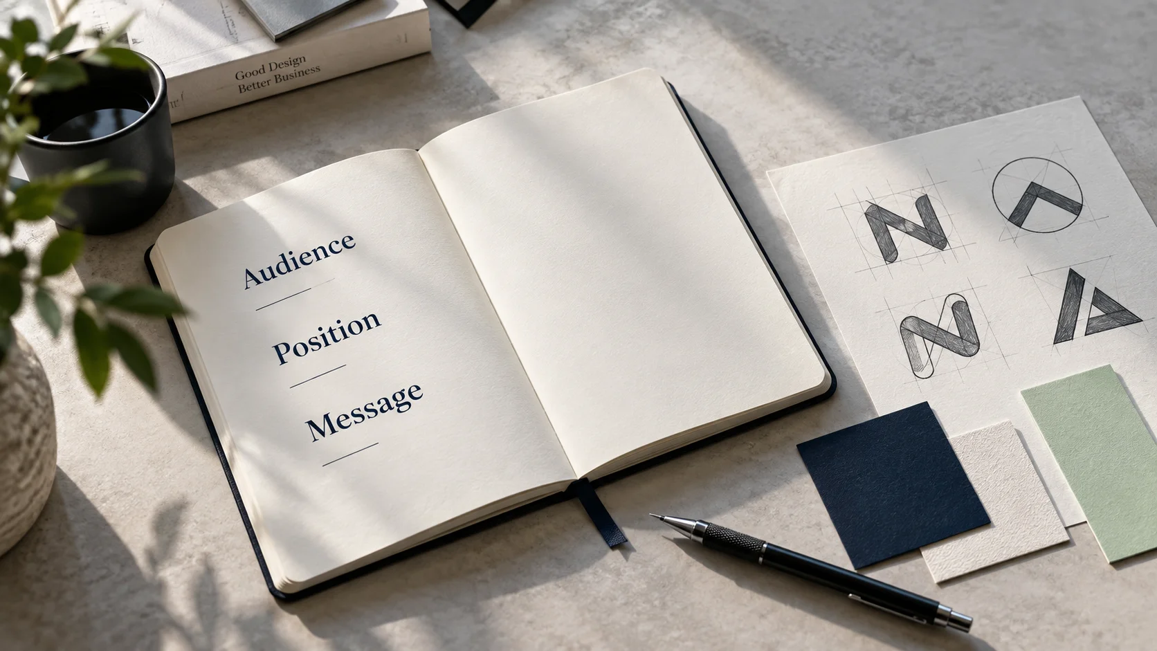
A logo redesign can feel like progress. It is visible, exciting and easy to announce. But if customers still cannot tell what your business does, who it helps or why they should choose it, a new logo will only give the confusion a better-looking container.
Before opening a moodboard or comparing typefaces, clarify the message the identity needs to carry. That work gives the designer a useful direction, helps your team make better decisions and makes the finished identity easier for customers to understand.
This does not mean every business needs a lengthy strategy project before changing a logo. It means the important questions should be answered before visual decisions begin.
The short version
Before redesigning your logo, be able to explain:
- who your best-fit customer is;
- what problem or situation brings them to you;
- what you help them achieve;
- why your approach is a relevant choice;
- what you want them to do next.
If those answers are unclear, begin with the message. If they are clear and the existing logo still creates practical or perception problems, a redesign may be the right next step.
A logo is a signal, not the whole explanation
Your logo helps people recognise and remember your business. Its shapes, type and colour can suggest qualities such as precision, warmth, confidence or energy. It also needs to work across practical settings, from a website header to a social profile, proposal, signboard or product label.
But a logo cannot carry the entire meaning of a business by itself.
It cannot explain a complicated offer. It cannot decide which customer matters most. It cannot prove that your service is reliable. It cannot turn a generic promise into a useful reason to choose you.
Those jobs belong to your positioning, messaging, customer experience and evidence. The visual identity should reinforce them.
Consider the line: “We provide innovative solutions for growing businesses.” It sounds polished, but it leaves the reader with several questions. What kind of solutions? Which growing businesses? What becomes easier or better? Why this company?
A stylish logo next to that sentence will not answer those questions. Clearer language might:
We design lead-focused websites for specialist service businesses that need to explain complex work clearly and turn more visits into qualified enquiries.
The second version gives a designer something meaningful to work with. It suggests clarity, expertise and forward movement. It also gives a potential customer enough information to decide whether the business is relevant.
First, decide what is actually wrong
“Our brand feels outdated” can describe several different problems. Separate them before deciding on a solution.
Signs that the message may be the main problem
- People regularly ask what your company actually does.
- Your team describes the business differently from one person to another.
- Your website relies on broad claims such as “quality,” “innovation” or “complete solutions.”
- You receive enquiries from people who are not a good fit.
- Customers understand individual services but not the overall value of working with you.
- Your marketing looks consistent, yet it still does not create a clear impression.
Signs that the logo or identity may need attention
- The logo becomes unreadable at small sizes.
- It does not work in one colour or on different backgrounds.
- The symbol, name or style reflects an earlier version of the business.
- Different teams use conflicting colours, typefaces and logo files.
- The identity looks too similar to competitors and causes confusion.
- You have no practical system for digital, print, social and presentation use.
Many businesses have both kinds of problem. In that case, clarify the message first and let it guide the visual redesign.
1. Define the audience by situation, not only demographics
“Small businesses” is usually too broad to guide a useful identity. Two companies with the same size can have very different needs, buying processes and expectations.
Describe the customer together with the situation that makes your offer relevant.
For example:
Too broad: Small and medium businesses in India.
More useful: Founder-led service businesses that have grown through referrals and now need a clearer website to support sales.
The second description gives you more than a market label. It reveals the customer’s current stage, the likely problem and the job the website or brand needs to do.
Use these questions to make the audience more specific:
- Who receives the greatest value from our work?
- What is happening when they begin looking for help?
- What have they already tried?
- What are they worried about getting wrong?
- What information do they need before they feel ready to enquire?
Do not guess all the answers in a meeting room. Review actual enquiry emails, sales calls, support questions and customer feedback. The phrases people use can reveal what they understand, what they value and where your message loses them.
A simple audience statement
Complete this sentence:
We are most useful to [type of customer] when they are [situation or stage] and need to [important outcome].
It is an internal decision-making tool, not necessarily a public tagline. Its purpose is to keep the project focused.
2. Clarify your position in the customer’s mind
Positioning is the place you want your business to occupy in relation to the customer’s needs and available alternatives. It helps answer: “Why should this be relevant to me?”
A practical positioning discussion should cover five points:
| Question | What to clarify | Example answer for an illustrative business |
|---|---|---|
| What category are we in? | The simple label customers already understand | Commercial solar installation partner |
| Who is it for? | The customer and buying situation | Factories with high daytime power use |
| What problem do we solve? | The costly or frustrating situation | Unpredictable electricity costs and unclear project planning |
| What is our useful difference? | A relevant way you work or value you provide | Technical assessment, installation and monitoring handled by one accountable team |
| What supports the claim? | Evidence a customer can examine | Site assessment process, documented projections, project credentials and ongoing reporting |
The useful difference does not need to be a world-first idea. It needs to matter to the customer and be something the business can consistently support.
“We care about quality” is weak because almost every competitor can say it. “One accountable team from site assessment through performance monitoring” is more concrete. It tells the customer what the working relationship will feel like and what risk it reduces.
3. Decide what customers should understand first
Your brand may have many services, strengths and stories. The first message should not attempt to communicate all of them at once.
Choose the one understanding that should form quickly when someone encounters the business.
Ask:
If a potential customer remembers only one useful thing about us after ten seconds, what should it be?
A good answer connects the business to a relevant outcome or problem. It is specific enough to be understood but broad enough to support the brand over time.
Then build a small message hierarchy:
Primary message
What you help the right customer achieve.
Supporting message
How you approach the work or why the offer is a strong fit.
Proof
What gives the customer a reason to believe the claim: relevant work, a clear process, credentials, testimonials, product details or measurable evidence.
Next step
The most useful action for the customer to take now: view relevant work, compare a service, request an assessment or start a conversation.
Here is an illustrative example for a growing accounting practice:
- Primary message: Clear financial reporting for founder-led companies that are ready to make decisions with better information.
- Supporting message: Monthly reporting and practical guidance, explained without unnecessary finance language.
- Proof: Named service scope, sample reporting process, professional credentials and relevant client references.
- Next step: Book a 20-minute fit call.
This hierarchy can guide the website headline, company profile, sales deck and campaign copy. It can also guide the identity. A brand promising calm clarity should not feel visually chaotic. A specialist with rigorous processes should not look careless or generic.
4. Test the message before you design around it
You do not need a large research programme to find obvious gaps. Put a simple draft in front of a few people who resemble your intended customer and ask them to explain it back to you.
Show the message briefly, then ask:
- What does this company offer?
- Who does it appear to be for?
- What seems different or useful about it?
- What would you expect to happen next?
- Which words feel unclear, vague or exaggerated?
Do not begin by explaining what you meant. Listen to what they understood. A message is doing its job when the intended meaning survives outside the room in which it was written.
Look for repeated confusion rather than treating every personal preference as a requirement. If one person dislikes a word, that is feedback. If several relevant people misunderstand the offer in the same way, that is a problem to solve.
5. Give the designer a brief with decisions, not decoration
A collection of logos you like can help discuss visual taste, but it is not a complete design brief. The designer also needs to know what the identity must communicate and where it must work.
Include:
- a clear description of the business and offer;
- the priority audience and buying situation;
- the main message customers should understand;
- your positioning and supporting evidence;
- three or four useful personality traits, explained in context;
- competitors and the conventions common in your category;
- the places where the identity will appear most often;
- practical limitations of the current logo;
- the required deliverables, formats and ownership terms;
- the people responsible for feedback and final approval.
Replace vague personality words with direction. “Modern and premium” could mean almost anything. “Calm, precise and established enough to reassure an operations director” gives the designer a clearer standard for judging ideas.
When a logo redesign is the right move
Clarifying the message does not mean keeping an unsuitable logo. A redesign is often justified when:
- the business has changed its offer, market or name;
- the identity attracts the wrong perception;
- the logo fails in important digital or physical settings;
- the company has grown without a consistent visual system;
- the current design creates confusion with another brand;
- the identity cannot support new products, services or locations;
- the original files are unusable and the mark cannot be reproduced reliably.
The important point is sequence. When message and positioning are clear first, the redesign can respond to a business need instead of a passing preference.
Common mistakes to avoid
Starting with a moodboard
Visual references are useful after the project has a direction. Starting with style can make the team choose what looks fashionable before deciding what is appropriate.
Asking everyone which logo they like
Large preference polls often produce safe, compromised work. Choose a small decision-making group and assess each direction against the agreed brief, audience and use cases.
Treating the logo as the entire brand
Customers experience your business through language, response times, proposals, service delivery, interfaces and follow-up. The logo is one recognisable part of that system.
Copying the visual language of the category
Looking familiar can help customers recognise what kind of business you are. Looking interchangeable makes it harder to remember you. Understand category conventions, then decide which ones support your position and which ones you can challenge.
Launching without a rollout plan
A new logo needs more than a reveal post. List every place the identity appears, assign owners and update high-visibility customer touchpoints first. Include old files and templates in the plan so they do not keep returning.
A practical process for your redesign
Use this five-stage sequence to keep the work connected to the business:
1. Diagnose
Review the current logo, messaging and customer journey. Identify where people become confused and where the identity fails in practical use.
2. Clarify
Agree on the priority audience, positioning, primary message, supporting proof and next action.
3. Brief
Turn those decisions into a focused creative brief with use cases, requirements, responsibilities and approval criteria.
4. Design the system
Develop the logo together with colour, typography, imagery, layout and verbal guidance. Test the identity in real applications instead of judging it only on a presentation page.
5. Roll out and review
Update customer-facing touchpoints, give the team usable files and guidance, and review whether the new system improves recognition and consistency over time.
A pre-redesign checklist
Before approving a logo project, make sure you can answer yes to these questions:
- We know which customer we most need to reach.
- We understand the situation that brings them to us.
- We can explain our offer in plain language.
- We have chosen the main idea customers should remember.
- We can support our claims with real evidence.
- We know what is failing in the current identity.
- We have listed the important places the new identity must work.
- We have a clear decision-maker and approval process.
- We have planned how the new identity will be introduced and maintained.
If several answers are no, pause the visual work long enough to resolve them. That pause can save rounds of subjective revisions later.
Frequently asked questions
Should we change our messaging before redesigning the logo?
Clarify the core message first. You do not need every line of website copy to be final, but the designer should understand the audience, offer, position and most important idea. Otherwise, visual decisions are likely to be based mainly on taste.
What is the difference between a logo refresh and a rebrand?
A logo refresh makes controlled visual improvements while preserving much of the existing recognition. A rebrand can involve deeper changes to positioning, messaging, identity and the experience around the business. The right scope depends on what has changed and what is currently failing.
How do we know whether our logo is outdated?
Age alone is not a good reason to replace it. Look at relevance and performance. Does it still represent the business? Is it distinctive enough? Does it remain clear at small sizes and across important applications? Can your team use it consistently? If not, it may need refinement or redesign.
Do small businesses need formal brand positioning?
They need clarity, even if the process is simple. A short, well-considered statement about the customer, problem, value and useful difference can be enough to guide better design and marketing decisions.
What should we send a designer before the project starts?
Send the business context, audience, positioning, message hierarchy, competitors, existing brand materials, practical use cases, known technical problems, required deliverables, timeline and decision process. Share visual references with an explanation of what is relevant in each one.
Make the redesign mean something
A successful logo redesign does more than make a business look current. It helps the right people recognise the business, understand its character and connect the visual impression with a clear promise.
Start with the sentence you want customers to understand. Make sure it is relevant, specific and believable. Then build an identity capable of carrying it consistently.
If your business is difficult to explain or the current identity no longer fits where you are going, Nothing Down can help connect the positioning, message and visual direction. Start a conversation at talk@nothingdown.in.