Nothing Down — An identity

Designing our own identity around connected work and an open path. A distinctive ND monogram, considered typography and a fresh colour palette bring the agency’s creative and digital services together.
INDUSTRY
Creative & Digital Services
PROJECT TYPE
In-house Brand Identity
SERVICES
Logo Design, Visual Identity & Brand Applications
ABOUT THE CLIENT

Nothing Down

The agency behind the identity.

Nothing Down brings together brand design, websites, content, digital marketing and AI automation. We help businesses explain what they offer, build useful digital experiences and connect the work that supports their next stage.


For this project, we turned that thinking towards our own identity. We wanted a brand that felt confident and creative, while remaining approachable and easy to understand. It needed to introduce the agency clearly and give our different services a shared visual language.

THE CHALLENGE

What they needed

What the identity needed to do.

Our work spans several disciplines, but the identity needed to feel like one agency. It had to express the connection between creative thinking and practical execution, without becoming a collection of symbols for every service.


The challenge was to give the name Nothing Down a clear visual meaning. We needed a distinctive mark, readable typography and a system that could move from a small profile icon to a website or presentation while keeping the same character.

OUR SOLUTION

What we delivered

Connected initials. A deliberate opening.

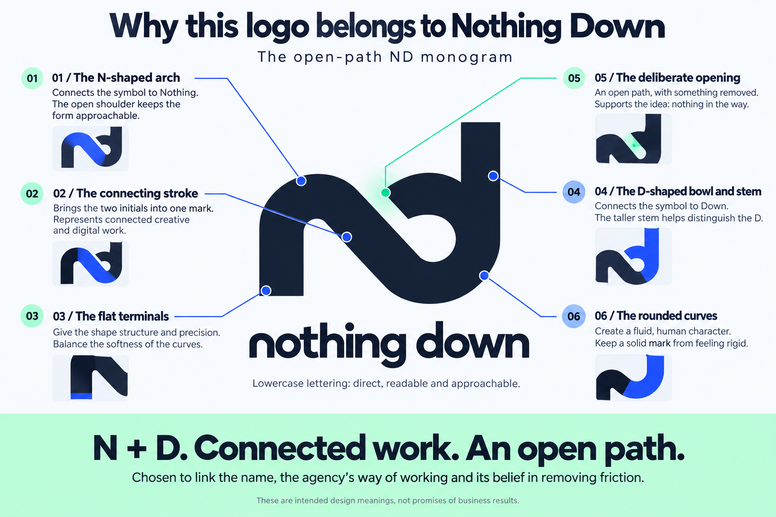
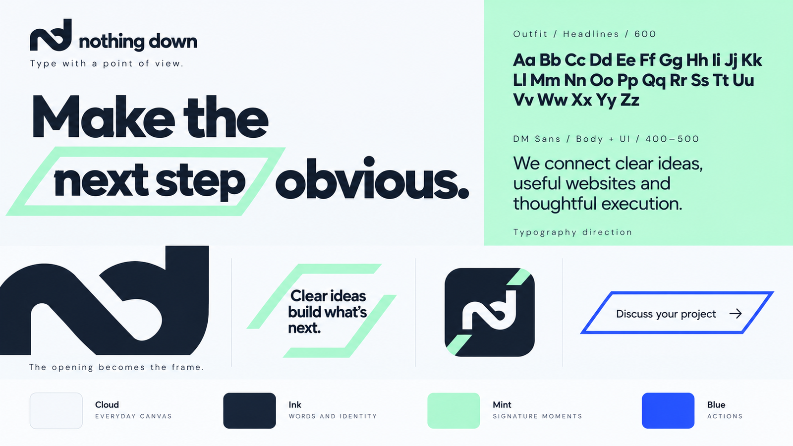
We brought the N and D together in a single monogram. The connecting stroke represents the relationship between our creative and digital work. A deliberate opening gives the mark its central idea: an open path, with nothing in the way. Rounded curves add an approachable quality, while flat terminals give the shape structure.


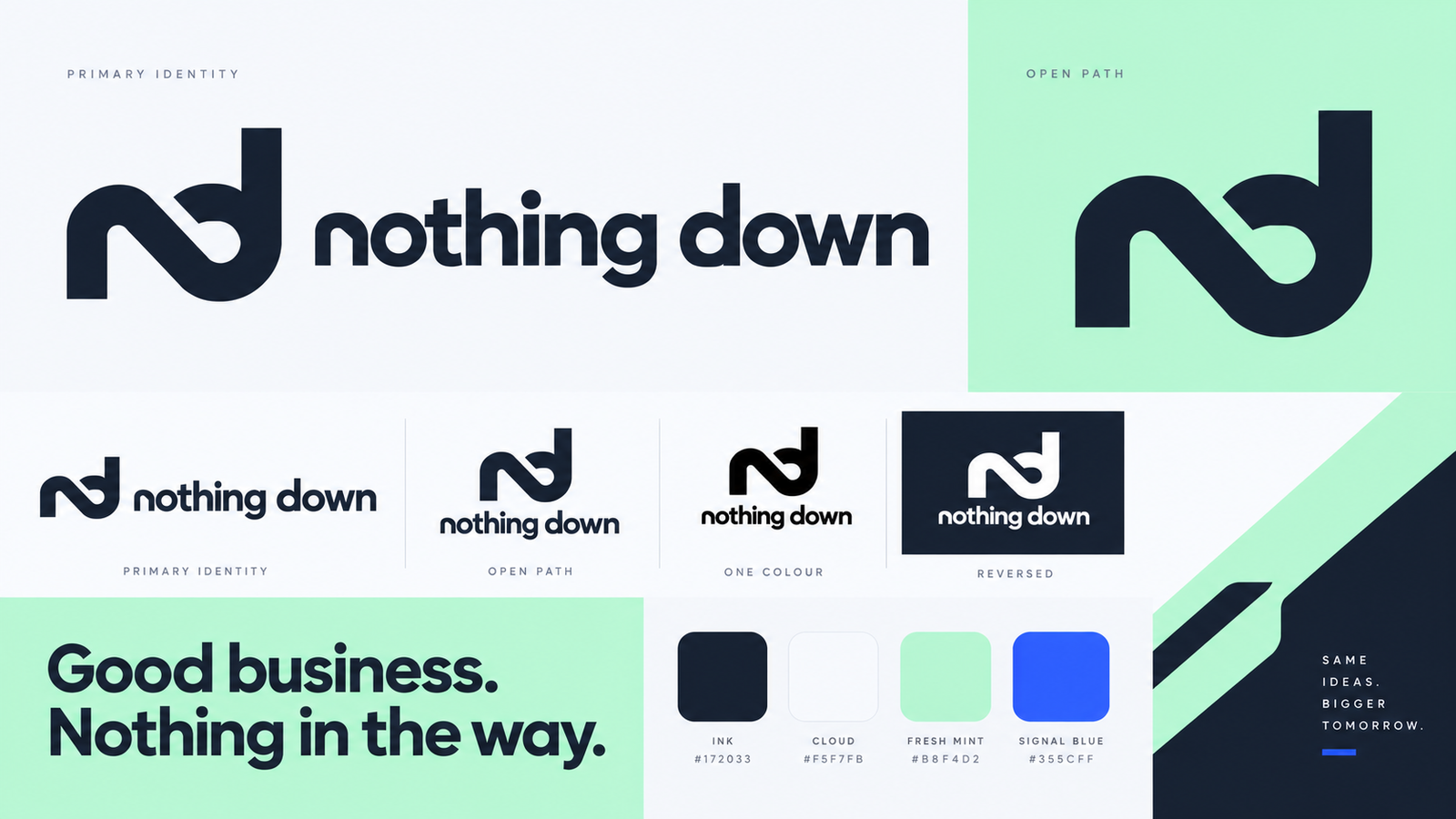
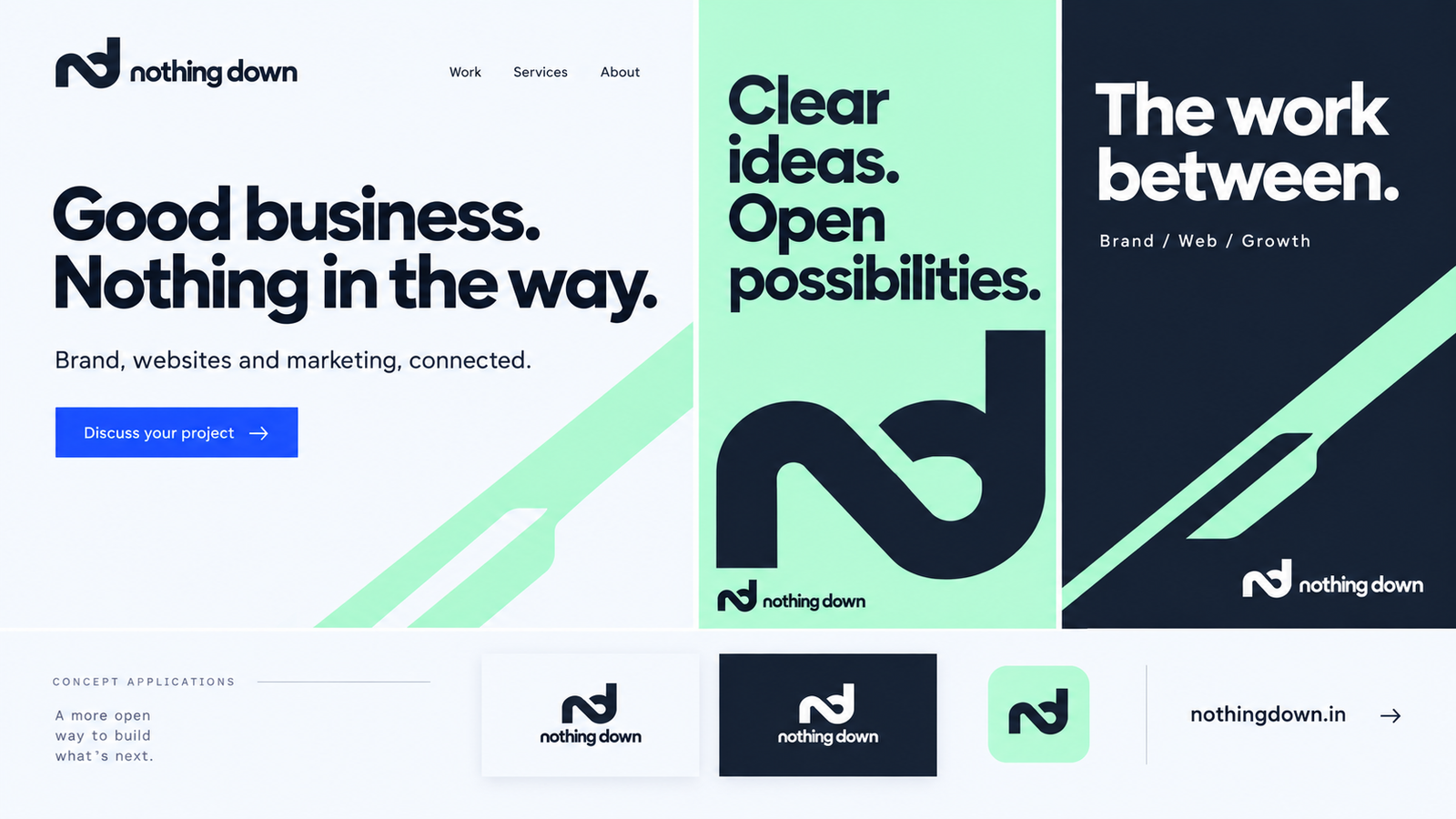
Around the symbol, we developed lowercase lettering, horizontal and stacked logo arrangements, and one-colour and reversed versions. Outfit headlines and DM Sans body text establish the typographic direction. An ink, cloud, fresh mint and signal blue palette gives each element a clear role.


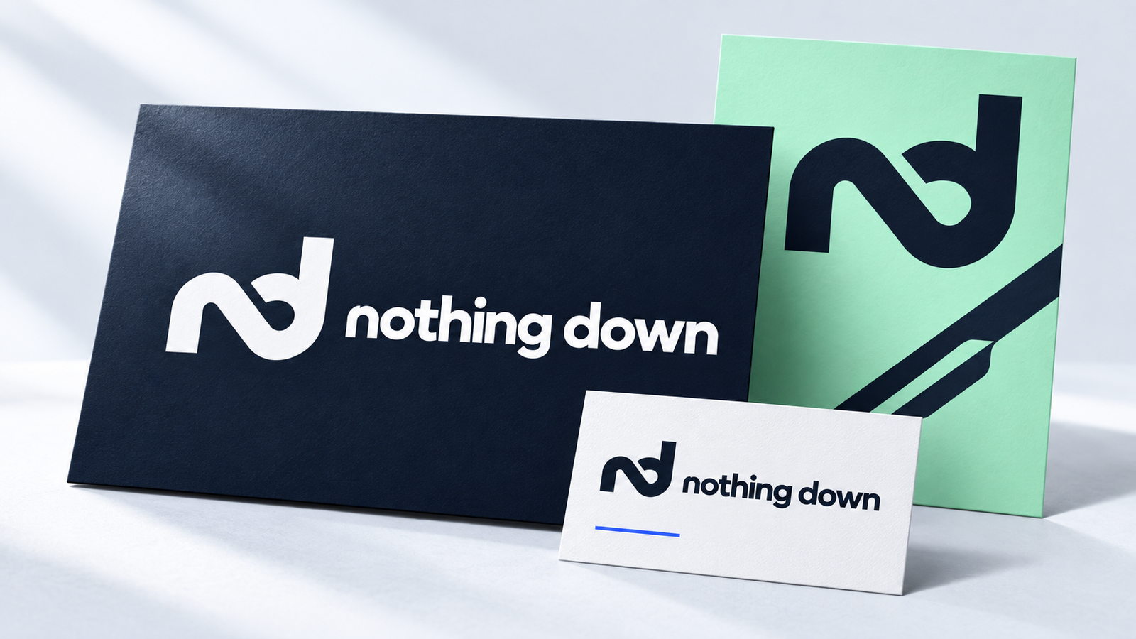
The opening also becomes a graphic device. Angled frames, cropped forms and directional shapes carry the idea into layouts, so the identity has a recognisable character beyond the logo itself.

THE IMPACT

How it performed

What we created.

The project brings Nothing Down’s visual identity into one connected system: a distinctive monogram, flexible logo arrangements, defined typography, a focused palette and graphic elements drawn from the mark itself.


Together, these give us a clear reference for creating future communications. The application concepts show how the identity can adapt to different formats while keeping its character. The result is a practical foundation for how we present the agency and the work we do next.

More work. Different challenges.

Scroll to Top