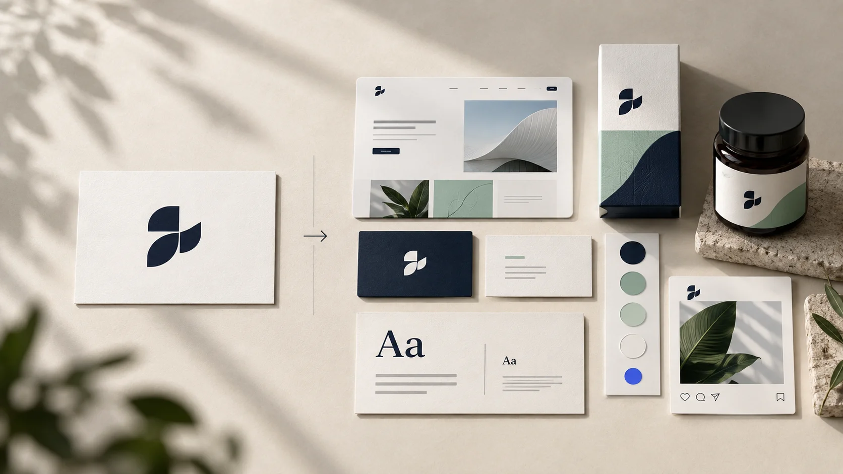
“We need a logo” sounds like a clear request. Often, it is not.
One business may genuinely need a simple, professional mark for an early-stage idea. Another may already have a usable logo but struggle with inconsistent colours, random social posts, mismatched proposals and a website that feels unrelated to everything else. A third may be changing its audience or offer and need to rethink the message before any visual work begins.
All three might ask for a logo. They do not need the same solution.
Understanding the difference between a logo and a brand identity helps you choose the right scope, set a realistic budget and avoid paying for files that do not solve the actual problem.
The short answer
A logo is a recognisable visual mark that identifies your business.
A brand identity is the wider visual system that helps your business look, feel and communicate consistently across different customer touchpoints.
The logo lives inside the identity. The identity supports the brand. The brand itself is the impression people form through everything they see, hear and experience from the business.
| Term | What it means | A simple example |
|---|---|---|
| Logo | A distinctive name, symbol or combination used to identify the business | The wordmark in your website header |
| Brand identity | The coordinated visual and verbal tools used to present the business | Logo, colours, type, imagery, layouts and templates |
| Brand | The reputation and meaning people attach to the business over time | “They make complicated work feel clear and dependable” |
A designer can create a logo and identity. Your brand is built as the business repeatedly delivers on what those elements promise.
What is a logo?
A logo is the most concentrated visual identifier of a business. It helps someone recognise who a communication, product or experience belongs to.
A logo may take several forms:
- Wordmark: the business name drawn or typeset in a distinctive way;
- Lettermark: initials used as the main identifier;
- Symbol: a pictorial or abstract mark;
- Combination mark: a symbol paired with the business name;
- Emblem: words and imagery contained within a shape or badge.
The right form depends on the name, audience, category and places where the logo must appear. A long business name may benefit from a compact symbol or monogram for small spaces. A new business with an unfamiliar name may need to use its wordmark more often before a symbol can stand alone.
What a good logo should do
A practical logo should:
- be recognisable without unnecessary detail;
- remain clear at the smallest size in which it will be used;
- work on light, dark and visually busy backgrounds;
- reproduce reliably in digital and print formats;
- feel appropriate for the business and audience;
- avoid looking confusingly similar to direct competitors;
- have variations for the layouts the business actually uses.
A logo does not have to explain every service. It needs to identify the business clearly and support the position the business wants to hold.
What is a brand identity?
A brand identity is the system that surrounds the logo and gives the business a consistent way to show up.
It answers practical questions such as:
- Which logo version should appear in a narrow mobile header?
- Which colours are used for backgrounds, buttons, headings and alerts?
- Which typefaces make documents and websites feel connected?
- What kind of photography represents the business accurately?
- How should a social post, proposal and presentation look related without being identical?
- What visual elements can create recognition when the logo is not prominent?
A well-designed identity gives the team enough structure to make consistent decisions without making every piece of communication look like a copy of the previous one.
A useful identity is a system, not a folder of attractive files
Receiving several logo versions, colour codes and fonts does not automatically mean you have a useful brand identity. The parts need rules, relationships and examples.
For instance, a colour palette becomes more useful when it defines:
- the primary brand colour;
- supporting and accent colours;
- background and text combinations;
- contrast requirements for readability;
- approximate usage proportions;
- digital and print values.
Typography becomes more useful when it explains which typeface and weight to use for headings, paragraphs, labels and data. Photography guidance becomes useful when it describes subject, composition, lighting, treatment and what to avoid.
The value is not simply in having more assets. It is in helping people use them correctly.
Visual example 1: A neighbourhood café
Imagine a café called Field & Cup. The example is illustrative, but the distinction is common in real projects.
If the café commissions only a logo
It may receive a warm serif wordmark with a simple cup symbol. The mark can appear on the signboard, menu and social profile.
The café is identified, but many design decisions remain open:
- What colours should the menu use?
- Which font should staff use for daily specials?
- How should takeaway cups and food labels look?
- What style of photography should appear on Instagram?
- How should offers be displayed without making the brand feel cheap?
If different suppliers answer those questions independently, the café can quickly look inconsistent even though the logo itself is good.
If the café develops a brand identity
The same logo may sit within a system that includes:
- a cream, coffee-brown and fresh green colour palette;
- a serif display typeface paired with a readable sans serif;
- a hand-drawn ingredient illustration style;
- warm, natural-light photography guidance;
- cup, menu, label and social-post layouts;
- simple rules for seasonal offers and in-store signage.
The logo has not become more complicated. The experience around it has become more coherent.
Visual takeaway: The logo tells you whose coffee it is. The identity helps the cup, menu, space and social content feel as though they belong to the same café.
Visual example 2: A B2B manufacturing company
Now imagine Arcline Components, a manufacturer supplying precision parts to industrial buyers.
The logo-only approach
The company receives a strong geometric wordmark and an “AC” monogram. It works on the website and factory entrance.
But the sales team still uses old presentation templates. Product sheets have inconsistent diagrams. Trade-show graphics use unrelated colours. Technical documents are difficult to scan. The business looks different in every setting where a buyer evaluates it.
The identity-system approach
An appropriate identity might add:
- a controlled industrial colour palette;
- typography designed for both technical data and commercial messages;
- a clear diagram and icon style;
- product-photography guidance;
- specification-sheet and capability-deck templates;
- trade-show and LinkedIn layout principles;
- document covers, tables and callout components;
- rules for using the monogram on equipment and small parts.
The visual system helps the company communicate precision before a salesperson begins explaining it.
Visual takeaway: For a B2B company, consistency is not decoration. It can make detailed information easier to navigate and help the organisation appear prepared at every stage of a long buying process.
Visual example 3: An independent consultant
An independent consultant may not need a large identity programme on day one.
A focused starter system could include:
- a clear wordmark;
- one compact profile mark;
- two typefaces;
- a small colour palette;
- a simple portrait treatment;
- a proposal cover and presentation template;
- a LinkedIn post layout;
- a one-page usage guide.
That may be enough to create a professional and consistent presence without producing packaging, signage or a large icon library the consultant will never use.
Visual takeaway: A brand identity should fit the business model. More deliverables do not automatically create more value.
What is usually included in a professional logo package?
The exact scope varies, but a complete logo handover commonly includes the following.
1. Primary logo
The main version used in the most common situations.
2. Secondary or responsive logo
A variation for spaces where the primary arrangement does not fit—for example, a stacked version for square layouts or a horizontal version for website headers.
3. Brand mark or icon
A compact symbol, monogram or initial for favicons, social profiles and other small applications. Not every business requires a separate symbol.
4. Colour variations
Versions for full colour, black, white and one-colour reproduction, with guidance on suitable backgrounds.
5. Production-ready files
Typical formats include:
- SVG: scalable digital use and many web applications;
- PDF or EPS: vector artwork for professional production;
- PNG: transparent-background digital use;
- JPG: situations where a standard flattened image is needed.
The handover should not rely only on JPG or PNG files. Those raster formats can lose quality when enlarged.
6. Basic usage guidance
At minimum, the guide should explain clear space, minimum size, colour versions and obvious misuses. Even a strong logo can become inconsistent without simple rules.
What is usually included in a brand identity package?
A brand identity package often includes the logo deliverables above plus a selection of the following components.
Logo system
Primary, secondary and compact marks, colour variations, spacing rules and application guidance.
Colour system
Primary, secondary and accent colours with HEX, RGB, CMYK and—when the project requires it—Pantone references. Useful guidance also explains contrast and hierarchy.
Typography system
Primary and supporting typefaces, weights, sizes and example hierarchy for headings, body copy, labels and calls to action. Licensing responsibilities should be stated.
Photography or illustration direction
Guidance for subject matter, framing, lighting, colour treatment and selection. If illustration is central to the identity, the package may define its shapes, line work, texture and motion.
Graphic language
Patterns, frames, lines, shapes, textures, iconography or other elements that build recognition beyond the logo.
Layout principles
Grid, spacing, alignment and composition examples that show how elements work together across common formats.
Verbal guidance
Depending on the scope, this may include a short brand idea, messaging hierarchy, tone principles, preferred language and sample headlines. Full positioning, naming and copywriting are often separate strategic deliverables, so confirm what is included.
Priority applications
Templates or designs for the places the business uses most. These might include:
- business cards and stationery;
- proposals and invoices;
- sales presentations;
- social profile and post templates;
- website interface examples;
- packaging and labels;
- signage and vehicle graphics;
- uniforms or merchandise;
- brochures, data sheets or reports;
- email signatures and campaign graphics.
Brand guidelines
A reference document explaining how to use the system. Its length matters less than whether the team can find the correct asset and make confident decisions.
Deliverables that may not be included unless you ask
The phrase “complete branding” can hide very different scopes. Do not assume the following are included:
- business naming or renaming;
- audience research and positioning;
- tagline development;
- website copywriting;
- website design or development;
- packaging structure or print production;
- social-media management;
- product photography;
- paid font, image or software licences;
- trademark searches or legal registration;
- printing, fabrication or installation;
- editable templates for every application;
- ongoing brand management.
Ask for a written deliverables list that names the formats, number of concepts, revision process, usage rights and responsibilities for third-party costs.
Logo, starter identity or full brand identity—which should you choose?
Choose a logo package when:
- the business is early and needs a credible identifier to begin operating;
- the offer and audience are already clear;
- only a few simple applications are required;
- you have an existing design system that the new logo must join;
- the immediate budget is limited and the scope is intentionally phased.
Even then, include basic colour, typography and usage guidance. A logo with no rules is difficult to use well.
Choose a starter identity when:
- you need consistency across a website, proposal and social presence;
- a small team creates regular customer-facing materials;
- the brand needs to launch professionally without a large number of applications;
- you want a foundation that can expand as the business grows.
A starter identity is often the most practical choice for a new service business. It solves current needs without pretending to predict every future application.
Choose a fuller brand identity when:
- customers meet the business across many channels or locations;
- multiple staff members, agencies or suppliers produce materials;
- packaging, signage, retail or detailed documentation is important;
- the business is repositioning or moving into a new market;
- inconsistent presentation is weakening trust or recognition;
- the identity must support several services, products or sub-brands.
Begin with strategy when:
- the team cannot agree on the priority audience;
- the offer is difficult to explain;
- the business is changing direction;
- competitors all make similar claims;
- you are hoping a visual redesign will solve a positioning problem.
If that sounds familiar, read Before You Redesign Your Logo, Clarify Your Message before deciding on the visual scope.
A simple decision table
| Your current situation | Most useful starting point |
|---|---|
| Clear offer, one or two basic applications, very early stage | Logo plus basic visual starter kit |
| Clear offer, but website, proposals and social content look unrelated | Starter brand identity |
| Several teams, channels, products or locations | Broader identity system and guidelines |
| Audience, offer or difference is unclear | Positioning and messaging before visual design |
| Existing identity works but is inconsistently used | Brand audit, asset cleanup and practical guidelines |
| Logo fails at small sizes or in digital use | Responsive logo refinement, not necessarily a full rebrand |
How to assess a proposal from a designer or agency
Do not compare proposals only by the number of pages or mockups. Look for evidence that the scope connects to how your business operates.
Ask these questions:
- What problem is this project intended to solve?
The answer should be more specific than “make the brand look better.” - Which deliverables are included?
Request an itemised list, including file formats and editable templates. - How many directions and revision rounds are included?
Understand the decision process before work starts. - Who is responsible for strategy and content?
Visual work can be delayed when messaging decisions have no owner. - Will designs be shown in our real applications?
A logo should be tested where customers will actually see it. - What usage rights and source files will we receive?
Confirm ownership, licences and any restrictions in writing. - What happens after approval?
Ask about file organisation, team handover, templates and implementation support.
Common mistakes businesses make
Buying the largest package because it looks complete
An extensive identity is wasteful if most deliverables will remain unused. Start with the touchpoints that influence customers now and create a system that can grow.
Choosing only by personal taste
The founder needs to feel confident in the identity, but “I like it” is not enough. Assess whether it fits the intended audience, position, personality and practical use cases.
Expecting the logo to explain the offer
A logo can signal character and category. Clear messaging, content and customer experience still need to explain the value.
Requesting every file without knowing its purpose
A disorganised folder with hundreds of exports can create more confusion. Ask for a labelled handover with a master vector file, common-use exports and straightforward instructions.
Ignoring implementation costs
The design fee may not include replacing signs, printing packaging, rebuilding a website, licensing fonts or updating every sales document. Plan the rollout before approving the project.
Treating templates as a substitute for guidance
Templates help with repeated formats. The identity still needs principles for new situations that were not included in the original package.
What your business actually needs
There is no universal list of brand deliverables that every business should buy. The right scope depends on where customers meet you, who creates the material and what is currently preventing the business from communicating clearly.
Start with three questions:
- Where do customers form their first impression of us?
- Which customer-facing materials do we create repeatedly?
- Where does inconsistency currently create confusion or extra work?
Use the answers to choose priority applications. A manufacturer may need capability decks and data sheets before social templates. A restaurant may need menus, signs and packaging. A consultant may need a website, proposal and presentation system. An ecommerce brand may need product imagery, packaging and campaign components.
Good scope is not about producing the most. It is about building the smallest complete system that can support the business properly.
Frequently asked questions
Is a logo the same as branding?
No. A logo is one visual identifier. Branding is the broader work of shaping how a business is presented and experienced. It can include strategy, messaging, identity, content, service behaviour and consistent delivery.
Can I start with a logo and build the identity later?
Yes, if the first logo is designed with future use in mind. Begin with essential variations, colours, typography and clear file organisation. Document the decisions so the system can expand without starting again.
Does a small business need brand guidelines?
It needs guidance proportionate to its team and activity. A short, practical document may be enough for a small business. If several people and suppliers create materials, more detailed guidelines become valuable.
How many logo versions should a business have?
There is no required number. Most businesses benefit from a primary version, an alternative layout and a compact mark where appropriate, plus colour and one-colour variations. Each version should solve a real application need.
Should social-media templates be included in a brand identity?
Include them if social media is an active customer touchpoint and your team will use the templates. Define a small flexible system rather than creating many rigid designs that become repetitive.
Does brand identity include website design?
Not automatically. The identity provides the visual foundation, while website design applies that system to navigation, content hierarchy, interactions and conversion paths. Confirm whether website design and development are separate deliverables.
Choose the scope that solves the real problem
If your business only needs a clear identifier, a focused logo package may be enough. If the logo looks fine but everything around it feels disconnected, you probably need an identity system. If the business itself is hard to explain, begin with positioning and messaging before commissioning either.
The best project is not the one with the longest deliverables list. It is the one that gives your business the right tools to be recognised, understood and presented consistently.
Ready to clarify what your business needs?
Nothing Down can help you define the right scope—from a focused visual foundation to a connected brand identity built around your audience and real customer touchpoints.