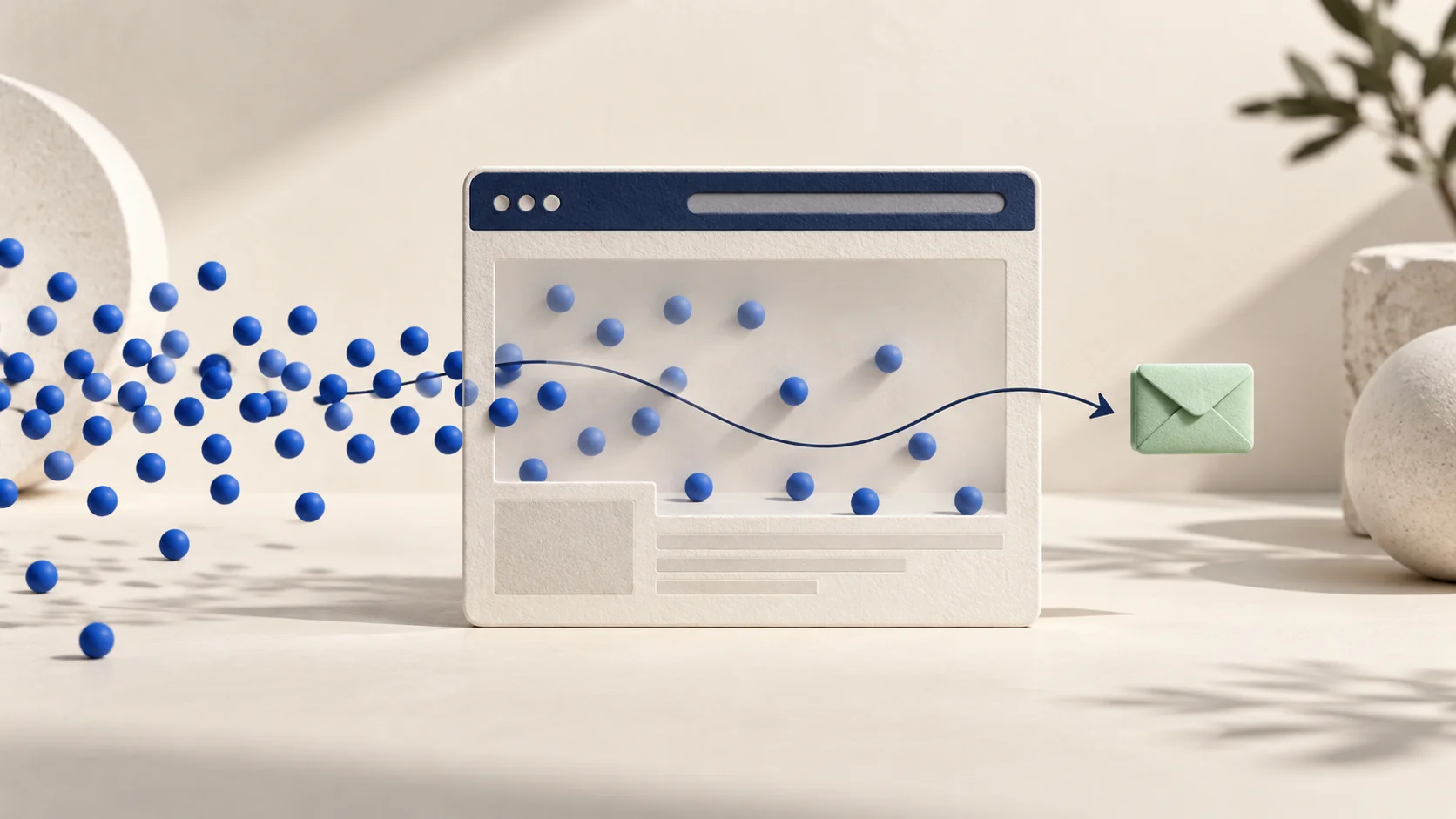
Your website is receiving visitors. People are finding it through search, advertisements, social media, referrals or direct links. The traffic report looks active, yet the inbox remains quiet and the phone rarely rings.
It is tempting to treat this as a traffic problem and look for more visitors. Sometimes that is necessary. Often, however, the website is already losing the attention it has earned. People arrive, but the page does not help them understand the offer, trust the business, decide whether it fits their situation or take a comfortable next step.
That gap is a conversion problem. It can come from the source of the traffic, the promise that brought someone to the page, the wording above the fold, the evidence provided, the mobile experience, the contact form or even what happens after a person submits it. A beautiful website can have this problem. A highly ranked website can have it too.
The right response is not to change every button or copy a competitor’s landing page. It is to identify where the journey breaks and improve that point with evidence.
The short answer
A website usually receives visitors but few enquiries when one or more of these conditions is present:
- the visitors are not the right people;
- the page does not quickly explain what the business offers;
- the offer feels too broad or too similar to alternatives;
- the content does not answer the questions required for a decision;
- the site asks for trust without providing enough evidence;
- the mobile experience creates friction;
- calls to action are vague, poorly timed or difficult to find;
- the form asks for too much or fails technically;
- the next step feels like a large commitment;
- tracking records visits but not the actions leading to an enquiry;
- enquiries are answered too slowly or without a clear process.
Before investing in additional traffic, confirm which of these problems is affecting your site. Sending more people into a weak journey usually creates more exits, not more opportunities.
Traffic is not the same as buying intent
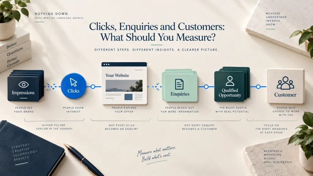
A visitor is simply a person or session that reached the website. That person may be researching a topic, comparing suppliers, looking for a job, checking an address, returning to read an article or trying to understand a service they may need months from now. Not every visit should become an enquiry.
This matters because a site can grow traffic without growing commercial opportunity. A useful article may attract many early-stage readers, while a focused service page attracts fewer people who are closer to choosing a provider. The article is not failing; it is doing a different job. The mistake is measuring every page by the same expectation.
Start by separating traffic according to source, landing page and likely intent. Someone searching for “what is brand identity?” is in a different stage from someone searching for “brand identity agency for a new business.” A visitor coming from a portfolio link has different context from someone arriving through an advertisement that promises a free audit. If those sessions are combined into one traffic number, the number tells you very little about why enquiries are low.
Ask three questions:
- Which pages are attracting the visits?
- What was the person probably trying to accomplish on each page?
- What would be a reasonable next action at that stage?
For an educational article, a useful next action might be viewing a related service, downloading a checklist or reading a case study. For a high-intent service page, it may be starting a conversation. Conversion improves when the next step matches the visitor’s readiness rather than forcing every person into the same form.
1. The traffic and the page may not match
People arrive with an expectation created somewhere else. A search result, advertisement, social post or referring website makes a promise. The landing page must continue that promise with the same subject, language and level of specificity.
Imagine an advertisement offering “landing pages for education admissions campaigns,” but the click leads to a general agency homepage covering branding, social media, SEO and websites. The company may be capable, but the visitor now has to search for the service they were promised. That extra work weakens confidence and increases the chance of leaving.
The same mismatch can happen in organic search. A page may rank for a phrase that is related to the content but not closely related to the service being sold. The traffic appears relevant at a high level, yet the visitors are looking for definitions, free resources or career information rather than a provider.
Review each important traffic source and compare its promise with the first screen of the destination page. The visitor should not have to wonder whether the click brought them to the correct place. Use a dedicated landing page when the campaign, audience or offer is specific enough to require its own message.
What to check
- Search queries or advertisement themes leading to the page
- The title and description shown before the click
- The page headline and opening paragraph
- Whether the same service, audience and outcome continue after arrival
- Whether campaign traffic is sent to a general page without a clear path
2. The first screen does not make the business clear
The top of a page has a simple responsibility: help the right person recognise that the page is relevant. It does not need to explain every detail immediately, but it should create enough understanding to earn the next scroll.
Many websites begin with statements such as “Empowering growth through innovation,” “Solutions for a better tomorrow” or “Your trusted partner for success.” These lines may sound positive, but they make the visitor do the interpretation. The person still does not know what the business offers, who it is designed for or what kind of result it supports.
A clearer opening usually combines four ideas: the offer, the audience or situation, the useful outcome and an appropriate next step. It can still have personality, but clarity must arrive before cleverness.
Generic opening
Transforming businesses through creative digital excellence.
Clearer opening
Websites and landing pages for service businesses that need to explain their offer clearly and turn interest into qualified enquiries.
The second line is not perfect for every business, but it reduces uncertainty. A visitor can quickly decide whether to continue. That matters because conversion does not begin at the form; it begins when the person recognises, “This appears to be for someone like me.”
If your message is difficult to state clearly, the issue may begin before web design. The principles in Before You Redesign Your Logo, Clarify Your Message also apply to websites: know the audience, the relevant problem and the understanding you want to create.
3. The offer is present, but it is not easy to choose
A website can explain what a company does and still leave the visitor unsure about what to buy. This often happens when several services receive equal weight, service names are internal rather than customer-friendly, or each page describes activities without explaining the situation in which the service is useful.
For example, “strategy, design, development, optimisation and consulting” is a list of capabilities. A potential customer may still wonder whether they need a complete website, a landing page, an audit or only help improving an existing page. When the choice requires specialist knowledge, people delay the enquiry because they are afraid of selecting the wrong thing.
Organise services around recognisable needs. Explain who each service is for, the problem it addresses, what is included and what a reasonable next step looks like. If services are often combined, say so. If the business can help the visitor choose, make “Not sure where to start?” a genuine path rather than a small line at the bottom of the page.
Good service architecture reduces decision effort. It does not force every customer into a rigid package, but it gives them enough shape to understand where the conversation might begin.
4. The page talks about the company before the customer’s problem
Visitors need to know who you are, but they usually arrive because of something happening in their own business or life. If the page opens with the year the company was founded, a list of capabilities and several paragraphs about commitment, it delays the moment in which the visitor sees their situation understood.
This does not mean every sentence should say “you,” or that company history has no value. It means information should arrive in the order required for a decision. Begin by naming the problem or opportunity in language the customer recognises. Then explain how the service addresses it, why the approach is credible and who is behind it.
Compare these two directions:
We are a full-service agency with expertise across design, technology and marketing.
Your website may be attracting attention without giving people a clear reason to enquire. We connect the message, page structure and next step so interested visitors can move forward with confidence.
The second version makes the visitor’s situation the starting point. The business can introduce its capabilities after relevance has been established.
5. The website asks for trust but does not earn it
An enquiry involves risk. The visitor may be sharing personal details, exposing a business problem, committing time or beginning a purchase that will cost money. Before doing that, they look for signals that the company is legitimate, capable and appropriate for the work.
Weak websites often make large claims and provide little support. “High-quality service,” “experienced team” and “results-driven approach” are claims, not evidence. Repeating them in larger type does not make them more believable.
Useful proof depends on the business, but it may include real work, relevant outcomes, process details, credentials, team information, customer comments, product demonstrations, policies, recognised partners or clear contact information. Proof should appear near the claim it supports. A visitor should not have to reach the footer before discovering that the business has completed relevant projects.
Avoid invented numbers, vague “trusted by” logos and testimonials without context. Weak proof can reduce trust more than having no proof at all. If the business is early and has limited case studies, show the quality of the thinking: explain the process, show a sample deliverable, be clear about responsibilities and present the people behind the work honestly.
A practical proof sequence
For a service page, this order often works well:
- State the problem and outcome.
- Explain the service and approach.
- Show a relevant project, example or capability.
- Clarify the process and responsibilities.
- Answer risk-related questions.
- Offer the next step.
Trust is not one section. It is the consistency between the promise, the evidence, the design quality, the language and what happens when someone makes contact.
6. The page does not answer the questions needed for a decision
Short copy can feel clean, but it becomes unhelpful when important information is removed. A potential customer may like the design and understand the headline yet still leave because the page does not answer practical questions.
The questions vary by service, but visitors commonly want to understand scope, suitability, process, timing, responsibilities, pricing approach and what happens next. They may also want to know whether the business works with organisations like theirs, whether an existing system can be improved and what they need to prepare before the project begins.
You do not need to publish every price or contractual detail. You do need to reduce avoidable uncertainty. If pricing depends on scope, explain the factors that shape it. If timelines vary, give the stages and dependencies. If a discovery conversation is required, tell people what that conversation covers and whether they need to prepare anything.
Content should help a serious visitor decide, not merely persuade them to contact you for basic information. When a page answers meaningful questions, the enquiries may become fewer in number but better in fit—which is often a healthier outcome.
7. Calls to action are vague, inconsistent or poorly timed
“Learn more,” “Submit” and “Get started” are not always wrong, but they often hide what will happen after the click. A person considering a professional service may hesitate if “Get started” sounds like an immediate commitment or if “Contact us” gives no idea what kind of response to expect.
A stronger call to action describes the next step at the correct level of commitment. “Discuss your website,” “Request a project review,” “Check project fit” or “Tell us what you are planning” can feel more specific. The wording should remain truthful; do not call something a free strategy session if it is actually a qualification call.
Placement matters as much as wording. A call to action shown before the visitor understands the offer may be ignored. The same action shown after a relevant example, process explanation or FAQ can feel natural. Longer service pages can repeat the primary action at sensible decision points, provided the repetitions do not become visually aggressive.
Use one main action and a quieter alternative where necessary. For example, a visitor who is not ready to enquire may prefer to view work or read a related guide. Too many equally prominent buttons create competition instead of choice.
8. The contact form creates more work than the conversation feels worth
A form is a small interface with a large responsibility. It must collect enough information to route and understand the enquiry without making the visitor complete a project brief before the relationship has started.
Every field adds a decision. A budget dropdown may feel premature. A required company size field may be irrelevant to a small client. A long “tell us everything” box can make the person postpone the task until later. On mobile, cramped labels, small controls and an oversized form make that friction more visible.
Begin with what is necessary for the first response. For many service businesses, this may be name, email, phone number when genuinely useful, area of help and a short project description. Explain why information is requested, mark optional fields clearly and use selection controls only when they make the form faster.
The form must also behave reliably. Inline errors should identify the exact problem and preserve the information already entered. The submit button should show progress and prevent accidental duplicate submissions. A successful submission should display a clear confirmation and trigger a professional acknowledgement email. Spam protection should work quietly wherever possible rather than forcing every visitor through unnecessary puzzles.
Finally, provide a reasonable alternative such as a phone number or WhatsApp link when it fits the audience. Different visitors prefer different channels, especially on mobile. The alternative should not distract from the form, but it should be available.
9. Mobile visitors are being asked to tolerate a desktop page
A page can appear impressive on a large screen and become exhausting on a phone. Oversized headlines may consume the first screen, decorative animation may delay the message, cards may turn into a long repetitive stack and buttons may sit too close together. A form that looks compact on desktop can become twenty screens of scrolling on mobile.
Mobile quality is not simply whether the layout “responds.” It is whether a person can understand, navigate and act comfortably with limited space, touch input and variable network conditions. The content hierarchy may need to change. Proof may need to appear earlier. Navigation should be easier to close. Sticky actions should not cover content. Images must support the message without slowing the first view.
Test the complete enquiry journey on actual phones, not only by narrowing a browser window. Open the page from a search result, scan the first screen, use the menu, expand any accordions, tap every action, complete the form, trigger an error and review the confirmation. Small points of friction often become obvious only when the task is attempted from beginning to end.
10. The site feels slow, unstable or technically unreliable
Visitors do not separate technical performance from the business experience. If the page takes too long to become useful, moves while someone is trying to tap, loads important text late or fails during submission, confidence falls.
Heavy hero images, unnecessary video, multiple font files, third-party scripts, complex animation and overloaded WordPress or Elementor pages can all add delay. The solution is not to remove every visual detail. It is to prioritise what supports the page and deliver it efficiently.
Compress and size images for their actual display, avoid lazy-loading the main above-the-fold image by default, reduce scripts that do not support a real task and test forms after plugin, theme or cache changes. Technical monitoring should include the pages that produce enquiries, not only the homepage.
Treat performance data carefully. Laboratory tools are useful for finding issues, while real-user field data shows how actual visits behave over time. Neither replaces testing the customer journey yourself. A fast score cannot confirm that the message is clear, and strong copy cannot compensate for a broken form.
11. The website offers only one large commitment
Some visitors are interested but not ready to begin a project. If the website offers only “Book a call,” they must either make a significant commitment or leave without a useful next step.
A smaller action can keep the journey moving. Depending on the business, this might be viewing a related case study, checking a service-fit guide, requesting a checklist, seeing typical deliverables or reading how the process works. These actions should be genuinely useful, not artificial gates created only to capture an email address.
The aim is not to fill the page with options. It is to recognise that readiness develops. A strong website supports the visitor from initial understanding to serious evaluation and finally to enquiry. Internal links, relevant articles and clear service paths can perform that role without turning the site into a complicated funnel.
12. The enquiry arrives, but the response experience loses it
Website conversion does not end when the form is submitted. A generic confirmation, delayed reply or confusing follow-up can waste the trust created by the page.
Tell the person that the enquiry was received, what will happen next and when they can reasonably expect a response. Send an acknowledgement containing the visitor’s name, the reference or subject where appropriate, contact details and a brief summary of the next step. Avoid promising an immediate reply if the business cannot maintain it.
Internally, assign ownership. Enquiries should reach the right person, include the submitted details and be recorded in a system that prevents them from being forgotten. If the business uses WordPress, store submissions securely with appropriate access and retention controls while also sending reliable notifications through authenticated email delivery.
A thoughtful response process improves the quality of the entire website experience. The page makes a promise about how the business works; the follow-up is the first chance to prove it.
Diagnose the leak before redesigning the site
Changing colours, adding animation or rebuilding every page is rarely the best first move. Begin with evidence from the current journey.
Review the conversion path as a sequence:
Relevant visit → Clear first impression → Useful exploration → Trust → Decision information → CTA click → Form start → Successful submission → Timely response
If the site has analytics, measure meaningful steps rather than only page views. Useful events may include service-page views, portfolio views, primary CTA clicks, contact-page visits, form starts, validation errors, successful submissions, phone clicks, email clicks and WhatsApp clicks. Keep the event definitions documented so a future website change does not silently break reporting.
Numbers reveal where behaviour changes, but they do not always explain why. Combine analytics with form testing, session recordings where consent and privacy requirements are properly handled, customer questions, sales feedback and short usability sessions. A visitor saying “I could not tell whether you work with companies like ours” can provide direction that a bounce-rate number cannot.
A simple diagnostic table
| What you observe | Possible explanation | What to inspect next |
|---|---|---|
| High visits, very few service-page views | Informational traffic or unclear navigation | Landing pages, search intent and internal links |
| Service-page visits, few CTA clicks | Weak relevance, offer or proof | Headline, service structure, examples and CTA timing |
| Many CTA clicks, few form starts | Contact page creates hesitation | First paragraph, privacy reassurance and form length |
| Many form starts, few completions | Form friction or technical errors | Field-level abandonment, mobile layout and validation |
| Submissions recorded, few conversations | Slow or weak follow-up | Notification delivery, response time and qualification process |
| Desktop performs better than mobile | Mobile-specific friction | First screen, tap targets, speed, navigation and form controls |
Treat these as hypotheses, not automatic conclusions. Verify the actual page and behaviour before making a major change.
An illustrative example: traffic without a clear next step
Consider a fictional consultancy that helps manufacturers improve operational reporting. Its website receives visits through educational articles, referrals and LinkedIn. The homepage introduces the team and lists several capabilities, but it does not explain which operational problem the consultancy solves. The only call to action is “Contact us,” and the contact form asks for twelve required fields.
The business initially assumes it needs more traffic. A closer review shows that visitors are reading articles and visiting the homepage, but few continue to the service page. Those who reach the contact page often begin the form and leave before completing it.
The improvement is not one clever button. The homepage is rewritten around the situations that bring an operations leader to the consultancy. Services are organised into three clear starting points. A short example demonstrates the reporting process. The primary action becomes “Discuss your reporting challenge,” and the form is reduced to the information required for a useful first response. Related articles now link naturally to the relevant service.
This example does not promise that the changes will produce a particular conversion rate. It shows how diagnosis changes the solution. The company did not begin by buying more traffic or redesigning every screen; it first repaired the path between interest and action.
A practical website enquiry audit
Work through the site in this order.
1. Check traffic quality
Identify the landing pages, sources and search themes responsible for visits. Separate educational interest from commercial intent and remove internal or irrelevant traffic from the analysis where possible.
2. Test the first-screen message
Ask someone unfamiliar with the business to view the page briefly and explain what the company offers, who it helps and what they would do next. Do not explain the answer before they respond.
3. Review the offer structure
Check whether services are organised around customer needs and whether a visitor can recognise the right starting point without understanding your internal terminology.
4. Match claims with proof
For each important claim, identify the nearby evidence. Replace unsupported superlatives with specific process, work, credentials or examples.
5. Complete the journey on mobile
Use a real phone and test navigation, CTAs, forms, errors, confirmation and alternative contact methods. Note every moment that requires unnecessary effort.
6. Check the technical path
Confirm buttons, phone links, WhatsApp links, forms, email notifications and stored submissions work. Repeat the test after updates to plugins, caching or the template.
7. Review the response process
Check who receives the enquiry, what the user receives, expected response time and how the team records ownership and status.
What to improve first
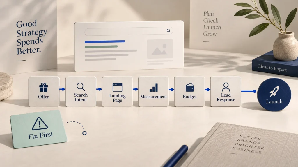
Prioritise changes by impact, evidence and effort. A broken form is more urgent than a new illustration style. An unclear service headline may matter more than redesigning the footer. A campaign landing on the wrong page should be corrected before increasing the advertisement budget.
A useful order is:
- Fix broken actions, forms and notification delivery.
- Correct traffic-to-page mismatch.
- Clarify the first screen and offer.
- Add relevant proof and decision information.
- Reduce mobile and form friction.
- Improve CTA wording and placement.
- Add appropriate lower-commitment next steps.
- Measure, observe and refine.
Make one meaningful set of changes at a time when traffic volume allows. If everything changes together, it becomes harder to understand what affected behaviour. For low-traffic websites, formal A/B testing may take too long to produce a useful result; direct usability testing and stronger qualitative evidence may be more practical.
Frequently asked questions
Why do I get website traffic but no leads?
The traffic may have low commercial intent, or the website may be losing relevant visitors through unclear messaging, weak proof, missing decision information, mobile friction, vague calls to action or a difficult form. Review the complete path from traffic source to follow-up rather than assuming the problem is visitor volume.
What is a good website enquiry rate?
There is no universal rate that applies to every site. It varies with the source, audience, offer, price, buying cycle, page type and definition of an enquiry. Establish your own baseline, separate high-intent pages and sources, and improve qualified outcomes rather than chasing a borrowed benchmark.
Should I display prices on a service website?
Display pricing when it helps the right customer assess fit and the service can be explained accurately. If every project is different, explain the factors that shape cost, provide a starting point or describe the scoping process. Hiding all pricing information may increase low-fit enquiries and uncertainty, but publishing a misleading fixed figure creates a different problem.
How many fields should a contact form have?
Use the fewest fields required for a useful first response. The correct number depends on the service and how enquiries are routed. Make optional fields visibly optional, group related inputs and review abandonment rather than following a universal field limit.
Should I use WhatsApp instead of a contact form?
Offer the channel that suits the audience and operating process. WhatsApp can reduce friction for mobile and local enquiries, while a form can collect structured information and support routing. Many businesses benefit from providing both, with one clearly presented as the primary path.
Will a complete redesign increase enquiries?
Only if the redesign solves the reasons people are not progressing. A new appearance cannot correct irrelevant traffic, an unclear offer, missing proof or poor follow-up by itself. Diagnose the current journey and define the problems the redesign must address.
How soon should we respond to an enquiry?
Respond as soon as the business can do so consistently and meaningfully. The confirmation should set an honest expectation. A quick automated acknowledgement is useful, but it should not replace a thoughtful human response.
More visits are valuable only when the journey works
Traffic creates an opportunity, not an enquiry. The website still needs to connect the visitor’s intention with a clear offer, enough confidence and a next step that feels appropriate.
When enquiries are low, resist the urge to solve the problem only at the top of the funnel. Study where the right visitors lose understanding, trust or momentum. Repair that point, verify the change and then decide whether more traffic is the next useful investment.
The strongest website is not the one that pushes every visitor into a form. It is the one that helps the right people understand the business, make an informed decision and begin a relevant conversation.
Want to find where your website is losing potential enquiries?
Nothing Down can review the message, page structure, mobile journey, calls to action and enquiry path—and turn the findings into a clear improvement plan.