What to Include in a Brand Design Brief
A designer can make better decisions when the business has made a few important decisions first.
That is the purpose of a brand design brief. It gives the designer enough context to understand the business, the audience, the problem and the practical requirements before visual directions begin.
A useful brief does not tell the designer exactly what the finished logo must look like. It explains what the design needs to achieve, where it needs to work and how the team will decide whether a direction is right.
Without that clarity, feedback often becomes personal: “make it more premium,” “try another colour” or “I thought it would look more creative.” With a clear brief, the conversation becomes more useful: “this direction feels too playful for the procurement audience,” or “the compact mark is not clear enough for our product labels.”
This guide explains what to include, what to leave out and how to turn rough business information into a brief a designer can genuinely use.
The short answer
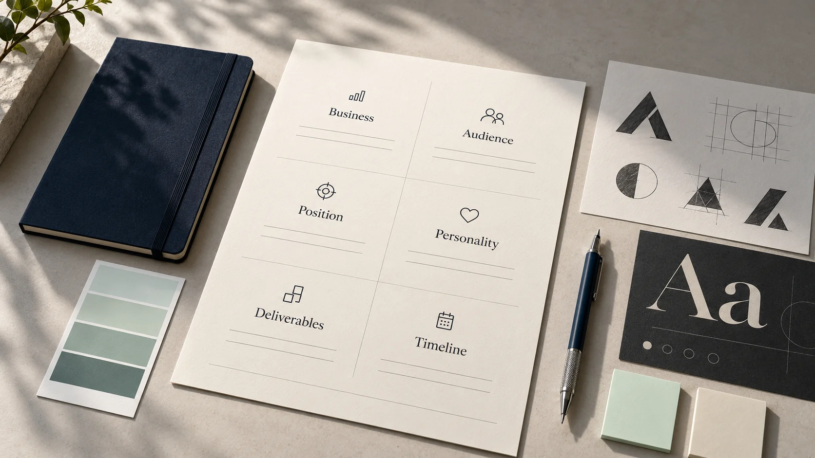
A complete brand design brief should explain:
- the business and what it offers;
- why the project is happening now;
- the problem the design must solve;
- the priority audience and buying situation;
- the positioning and key message;
- the relevant competitors and category conventions;
- the intended brand personality;
- the required deliverables and real use cases;
- the practical, technical and legal constraints;
- the timeline, budget and approval process;
- the available content and existing assets;
- the standard by which the work will be evaluated.
The brief should be specific enough to create direction and open enough to leave room for good creative thinking.
What is a brand design brief?
A brand design brief is a written agreement about the context, purpose, scope and constraints of a brand identity project. It is used by the business, designer or agency as a shared starting point.
Depending on the project, it may guide:
- a new logo;
- a logo refresh;
- a complete visual identity;
- a packaging identity;
- a brand refresh or rebrand;
- a visual system for digital products;
- a campaign identity;
- brand templates and guidelines.
The brief is not the final strategy, design concept or brand guideline. It sits earlier in the process. Its job is to collect the decisions and evidence required to begin the work responsibly.
A brief is not a moodboard
A moodboard explores a possible visual world. A brief explains the business problem and criteria that visual world must answer.
A brief is not a list of personal preferences
Preferences can be relevant, especially for a founder-led business, but they should not replace audience, positioning or application requirements.
A brief is not a guarantee that nothing will change
Discovery may reveal missing information or challenge an assumption. A good brief creates a strong starting point while allowing the project to learn.
Why the brief matters
Brand design contains many subjective choices. The brief gives those choices a shared purpose.
It helps the project team:
- understand the actual problem before discussing style;
- compare creative directions against agreed criteria;
- reduce contradictory feedback;
- estimate scope, time and cost more accurately;
- identify missing content or decisions early;
- plan for real applications rather than presentation-only mockups;
- protect the project from uncontrolled additions;
- explain decisions to stakeholders who join later.
A brief does not remove disagreement. It gives the team a better way to resolve it.
Who should prepare the brief?
The business should own the accuracy of the information. The designer or agency can structure it, ask better questions and challenge unclear answers.
For a small founder-led business, the founder and designer may prepare the brief together. For a larger organisation, useful contributors may include:
- the project owner;
- a founder or business leader;
- marketing or communications;
- sales or customer-facing staff;
- product or operations;
- someone familiar with production requirements;
- a final decision-maker.
Not everyone needs to write or approve every line. Assign one person to consolidate input and protect the final brief from becoming a collection of conflicting opinions.
1. Start with a plain-language business overview
Explain what the business does as though the designer has never encountered the category.
Include:
- the business name and location or markets served;
- the main products or services;
- how the business earns revenue;
- its current stage and size where relevant;
- important changes taking place;
- the business priorities connected to the project.
Avoid copying a long company profile filled with broad claims. A designer needs context, not ceremony.
Weak answer
We are a dynamic, customer-centric company delivering innovative, world-class solutions across multiple verticals.
Stronger answer
We provide preventive maintenance and emergency repair for production equipment used by mid-sized factories in South India. Most new work currently comes through referrals. We are building a stronger sales presence and need the business to look consistent across our website, capability deck, quotations and technician uniforms.
The stronger version reveals the offer, audience, region, current acquisition method and practical reason for the project.
2. Explain why the project is happening now
Design projects work better when the team can name the trigger.
Common triggers include:
- launching a new business or product;
- entering a new market;
- moving from referrals to active marketing;
- attracting a different type of customer;
- bringing several services under one identity;
- correcting an outdated or technically weak logo;
- preparing for new packaging, locations or digital products;
- resolving inconsistent materials across teams;
- creating distance from competitors;
- reflecting a major change in the business.
Write what has changed and what will happen if the issue remains unresolved.
Example
Our current logo was created when we offered one service. We now provide three connected services and sell to larger organisations. The existing identity is difficult to use in presentations and looks informal beside the companies we now approach. We need a clearer system before rebuilding the website and sales materials.
This is more useful than “we want a modern logo” because it explains the business movement behind the request.
3. Define the problem before defining the output
“We need a logo” is a requested deliverable. It is not necessarily the problem.
The underlying problem might be:
- customers do not understand what the company offers;
- the identity attracts the wrong perception;
- the logo fails at small sizes;
- teams use inconsistent colours and templates;
- the brand looks different across every touchpoint;
- the identity no longer represents the company’s direction;
- the business cannot launch a new product coherently.
Write the problem in one or two sentences.
Customers know our individual services, but they do not understand how they work together. The new identity needs to present the company as one connected specialist rather than three unrelated service lines.
This statement gives the designer a strategic problem to solve instead of a shape to decorate.
If the audience, offer or message is still unclear, resolve that before relying on visual design. Read Before You Redesign Your Logo, Clarify Your Message for a practical starting point.
4. Set clear project objectives
Objectives describe what the project should make possible. Keep them observable and connected to the business.
Examples include:
- create a recognisable identity that works across digital and physical applications;
- make three service lines feel part of one company;
- give internal teams templates they can use consistently;
- improve clarity and confidence during sales conversations;
- establish a flexible system for future products;
- preserve useful recognition while correcting technical logo problems.
Avoid unsupported promises such as “increase sales by 50% through the new logo.” A design project can support recognition, clarity and consistency, but business outcomes also depend on the offer, execution, marketing, sales and customer experience.
Choose three priority objectives
Long objective lists create weak priorities. Ask the team to select the three outcomes that matter most. Use those during concept evaluation.
5. Describe the priority audience in context
Demographics alone rarely give enough direction. “Men and women aged 25–45” does not explain what those people are trying to decide.
Describe:
- who the priority customer is;
- what role they play in the decision;
- what situation brings them to the business;
- what they need to understand;
- what risks or concerns they have;
- what alternatives they consider;
- where they encounter the brand;
- what creates confidence for them.
Weak answer
Our target audience is everyone who needs digital services.
Stronger answer
Our priority audience is the founder or marketing lead of an established service business preparing to improve its website and lead generation. They know the current presence is inconsistent but may not know which service to begin with. They value clear advice, practical scope and a team that can connect brand, website and marketing decisions.
Include secondary audiences only when they matter
Employees, distributors, investors, students, parents, procurement teams or partners may influence the identity. Explain their role instead of placing every possible audience at the same level.
6. Clarify positioning and the key message
The designer needs to know what the business wants to be known for—not only what it sells.
Summarise:
- the category the customer should place you in;
- the audience you are best suited to help;
- the problem or opportunity you address;
- the useful difference in your approach;
- the evidence supporting that difference;
- the first message customers should understand.
Use this working statement:
For [priority audience] who need [relevant outcome], [business name] provides [category or offer] that [useful difference], supported by [evidence].
This is an internal tool, not necessarily the final public tagline.
Example
For mid-sized manufacturers that need reliable maintenance without coordinating several vendors, Northline Engineering provides planned and emergency equipment support through one accountable service team, supported by documented response processes and experienced field technicians.
That statement suggests qualities such as readiness, precision and accountability. Those qualities can influence typography, layout, imagery and applications without dictating a logo shape.
7. Explain the offer and brand architecture
List the products, services or business units the identity must support.
Clarify:
- which offer is primary;
- how services relate to one another;
- whether customers buy them separately or together;
- whether sub-brands exist;
- which names must appear with the master brand;
- whether future offers are expected;
- whether the structure is likely to change.
This prevents the team from approving a logo that works for the company name but fails when applied to product lines, departments or locations.
Keep the structure proportionate. Do not create sub-brands simply because services need organising. Sometimes clear naming and layout are enough.
8. Review competitors and category conventions
The purpose of competitor review is not to copy what appears successful. It is to understand the visual environment in which customers will encounter the business.
For each relevant competitor, note:
- how it describes itself;
- the visual conventions it uses;
- what appears credible or useful;
- what feels interchangeable;
- where your position should be similar for recognition;
- where your identity should create meaningful distinction.
Include direct competitors, but also consider alternatives. A business may compete with internal teams, freelance providers, established firms or the decision to do nothing.
A useful competitor note
Most companies in the category use dark blue, metallic gradients, gear symbols and dense technical layouts. Blue may still be appropriate because buyers associate it with industrial reliability, but we should avoid another generic gear mark and create a more open information system for sales and service documents.
This gives the designer informed freedom. “Do not use blue because competitors use blue” would be a weaker conclusion.
9. Define personality with behaviour, not isolated adjectives
Words such as “modern,” “premium,” “bold” and “professional” are used so often that they can mean almost anything.
Choose three to five traits and explain what each means in your context.
| Trait | Too vague | More useful interpretation |
|---|---|---|
| Premium | Make it luxurious | Considered, restrained and well-made; never ornamental for its own sake |
| Bold | Use bright colours and large type | Confident enough to make one clear point; not loud or aggressive |
| Human | Add smiling stock photos | Use plain language, real situations and warmth without becoming casual |
| Technical | Add complex diagrams | Make precise information easy to understand; avoid visual clutter |
| Modern | Follow current design trends | Feel relevant to present-day digital use while remaining usable for years |
It can also help to define boundaries:
- confident, not arrogant;
- warm, not playful;
- established, not traditional;
- precise, not cold;
- expressive, not chaotic.
These contrasts give a designer a clearer emotional range.
10. List the real-world applications
Do not brief the identity only around a logo presentation. List where it will be used during the next 12–24 months.
Possible applications include:
- website header and favicon;
- mobile interface;
- social profiles and content;
- proposals and presentations;
- invoices, quotations and reports;
- product labels or packaging;
- shop or office signage;
- event graphics and exhibition stands;
- uniforms and identification cards;
- vehicle graphics;
- email signatures;
- recruitment material;
- app icons and digital-product interfaces;
- video intros, lower thirds or motion graphics.
Prioritise the applications that customers see most often or that are hardest to design correctly. A B2B service company may care more about a capability deck and proposal than a shopping bag mockup. An ecommerce business may need packaging labels and product imagery before stationery.
If you are unsure whether you need only a logo or a broader identity system, read Logo vs. Brand Identity: What Does Your Business Actually Need?.
11. Specify the deliverables
Convert the priority applications into an itemised scope.
A typical identity project may include:
- primary logo;
- secondary logo arrangement;
- compact brand mark;
- full-colour, black, white and one-colour versions;
- colour palette with digital and print values;
- typography system and licensing notes;
- photography or illustration direction;
- graphic devices, patterns or icon style;
- layout principles;
- selected templates;
- brand guidelines;
- final production files.
For every deliverable, clarify:
- what is being created;
- how many versions or templates are included;
- whether it will be editable;
- which file formats are required;
- who will produce or print it;
- whether copy and images will be supplied;
- whether implementation is included.
The phrase “social-media kit” can mean three profile assets or thirty editable templates. Specific scope protects both the client and designer.
12. Include practical and technical requirements
Brand design must survive real production.
Document requirements such as:
- minimum reproduction size;
- embroidery, engraving or one-colour printing;
- dark-mode or light-mode use;
- accessibility and colour contrast;
- bilingual or multilingual content;
- long business or product names;
- mobile and favicon legibility;
- packaging dimensions and print processes;
- screen, signage or vehicle viewing distances;
- internal software limitations;
- file compatibility with the tools the team uses;
- licensing requirements for typefaces, photography or illustrations.
Example
The compact mark must remain identifiable at 24 pixels in the website header and reproduce in one colour on technician uniforms. Presentation templates must be editable in Microsoft PowerPoint because the sales team does not use design software.
That single note may prevent two expensive implementation problems.
13. Share existing assets and known constraints
Give the designer access to relevant material:
- current logo and source files;
- past brand guidelines;
- website and social profiles;
- sales decks and proposals;
- packaging or signage files;
- product photography;
- customer research;
- existing messaging or strategy;
- registered marks and naming requirements;
- feedback from previous design work.
Explain what must remain and why. A colour may be strongly recognised. A symbol may have legal protection. A parent company may require a specific endorsement. A product interface may already depend on certain colours.
Separate real constraints from habits. “We have always done it this way” is information, not automatically a requirement.
14. Add visual references with explanations
References help when they are annotated.
Instead of sending ten logos with no context, explain what is relevant:
- “The restrained colour use feels appropriate for a serious B2B audience.”
- “The type hierarchy makes technical information easy to scan.”
- “The photography feels real and specific rather than staged.”
- “We like the flexibility of the layout system, not the actual colours.”
Also explain what to avoid and why:
- imagery that makes the company look larger or more global than it is;
- visual clichés common in the category;
- a playful tone that would weaken confidence;
- luxury styling that would suggest an unsuitable price position;
- trends that may date the identity quickly.
References should open a conversation, not turn the project into imitation.
15. Define budget, timeline and milestones
Budget and timing affect the possible scope. Sharing them allows the designer to propose an appropriate process instead of guessing.
Include:
- the available project budget or realistic range;
- the reason for any fixed deadline;
- launch or production dates;
- dependencies such as website development or packaging print;
- dates when key stakeholders are unavailable;
- preferred review and approval milestones.
Avoid setting a final deadline without accounting for feedback, revisions, production and rollout. If packaging must be printed by a certain date, the artwork approval deadline will be earlier.
16. Name the decision-makers and approval process
Projects slow down when the approval structure is unclear.
State:
- who owns the project day to day;
- who provides consolidated feedback;
- who has final approval;
- who should be consulted but does not approve;
- how feedback will be collected;
- how many review rounds are planned;
- what happens if stakeholders disagree.
Ask stakeholders to assess the work against the brief before discussing personal preference.
A useful concept review asks:
- Does this direction support the agreed positioning?
- Will it communicate the intended personality to the priority audience?
- Does it work in the most important applications?
- Does it create useful distinction within the category?
- Can the team apply it consistently?
17. Define what success will look like
Brand identity should not be judged only by immediate compliments. Define practical indicators connected to the project objective.
Possible indicators include:
- the team can produce materials without inventing new styles;
- the identity works across priority applications without losing clarity;
- customers can understand the offer and service structure more easily;
- sales and recruitment materials present one consistent company;
- the business can launch future offers within the same system;
- outdated logo files and templates are no longer being used;
- internal teams know where to find approved assets.
Some indicators can be observed immediately through testing and rollout. Broader recognition or commercial impact requires time and should not be attributed to design alone without evidence.
A filled example: the brief in practice
The following example is fictional and is included to show the level of detail that is useful.
Business
Northline Engineering provides planned maintenance and emergency repair for production equipment used by mid-sized factories in South India.
Why now
The business is moving beyond founder referrals and beginning structured sales outreach. Its current identity looks inconsistent across quotations, presentations, uniforms and the website.
Problem
The company appears smaller and less organised than the service it delivers. Buyers also struggle to understand the relationship between planned maintenance, emergency support and spare-parts coordination.
Priority audience
Plant heads, operations managers and procurement teams evaluating dependable maintenance partners. They value response readiness, clear scope, safety and accountability.
Position
One accountable maintenance partner that helps factories reduce the disruption created by coordinating several vendors.
Desired personality
- precise, not cold;
- prepared, not aggressive;
- experienced, not old-fashioned;
- direct, not oversimplified.
Priority applications
Website, capability deck, quotation template, service reports, technician uniforms, factory signage and LinkedIn communication.
Required deliverables
Responsive logo suite, colour and typography systems, icon direction, document layout system, capability-deck template, quotation cover, uniform application, signage concept and concise guidelines.
Technical requirements
The compact mark must work in one-colour embroidery and at favicon size. Templates must be editable in PowerPoint and Microsoft Word.
Success criteria
The three services feel connected, the sales team can use approved templates without design support, and the identity remains clear across digital documents and physical uniforms.
Notice that the brief does not say, “Use a blue shield with a machine inside.” It provides enough direction to create and evaluate ideas while leaving the visual answer open.
Copy-ready brand design brief template
Use the following template as a working document. Short, specific answers are more useful than long, vague ones.
1. Project details
- Business name:
- Project name:
- Project owner:
- Final decision-maker:
- Designer or agency:
- Target completion date:
- Planned launch date:
- Budget or budget range:
2. Business overview
- What does the business offer?
- Where does it operate?
- How does it earn revenue?
- What stage is the business at?
- What important change is currently happening?
3. Project background
- Why is this project happening now?
- What is not working in the current identity?
- What happens if the problem is not solved?
- Is this a new identity, refresh or rebrand?
4. Objectives
- What are the three most important outcomes?
- What should become clearer, easier or more consistent?
- What is outside the scope of this project?
5. Audience
- Who is the priority audience?
- What role do they play in the decision?
- What situation brings them to the business?
- What do they need to understand?
- What concerns or risks influence them?
- Where will they encounter the identity?
6. Positioning and message
- Which category should customers place the business in?
- What problem or opportunity does it address?
- What makes the approach relevant or different?
- What evidence supports the claim?
- What is the first idea customers should understand?
7. Offer structure
- What products or services must the identity support?
- Which offer is primary?
- Are there sub-brands, product names or endorsements?
- What future expansion should the system anticipate?
8. Competitors and context
- Who are the closest competitors or alternatives?
- What visual conventions are common in the category?
- Which conventions are useful?
- Which clichés or similarities should be avoided?
9. Personality
- Choose three to five traits.
- Explain what each trait means in this business.
- Complete: “We are ___, but not ___.”
- How should customers feel after encountering the brand?
10. Deliverables
- Which identity components are required?
- Which applications or templates are required?
- Which file formats are required?
- Which items must be editable, and in which software?
- Is implementation, printing or development included?
11. Practical requirements
- Smallest required size:
- One-colour use:
- Print or production methods:
- Accessibility requirements:
- Languages:
- Required software compatibility:
- Licensing restrictions:
- Legal or registered-mark requirements:
12. Existing assets
- Current logo/source files:
- Existing guidelines:
- Website/social links:
- Messaging or strategy documents:
- Photography/illustration:
- Sales and marketing materials:
- Elements that must remain:
13. Visual references
- References we find relevant:
- What specifically is useful in each reference:
- Styles or category clichés to avoid:
- Reasons for those exclusions:
14. Process and approval
- Project owner:
- Feedback contributors:
- Final approver:
- Feedback method:
- Review milestones:
- Number of revision rounds:
15. Success criteria
- How will we judge concepts?
- Which applications must be tested?
- What should the team be able to do after handover?
- What should be reviewed after launch?
What to leave out of the brief
Remove information that does not help the designer make or evaluate decisions.
Common distractions include:
- a long company history with no relevance to the project;
- every personal preference from every stakeholder;
- visual references with no explanation;
- fixed design solutions chosen before exploration;
- unsupported claims about being “the best” or “number one”;
- deliverables that have no realistic use;
- copied language from competitors;
- contradictory personality words without priorities.
A shorter brief with real decisions is stronger than a long document filled with marketing language.
Common mistakes to avoid
Writing the brief after design has started
This turns the document into justification rather than direction. Prepare it before concepts begin and update it only when discovery reveals something genuinely important.
Making every audience a priority
An identity may need to work for several groups, but the project needs a clear centre. Name the primary decision-maker and explain secondary audiences separately.
Using “premium and modern” as the strategy
Explain whose perception must change, what premium means in the category and which behaviours or applications should express it.
Adding deliverables without adjusting time or budget
Every template, application and production file needs work and review. Keep a visible scope and manage additions through a change process.
Giving separate feedback from several people
Contradictory comments waste time and weaken the result. Collect feedback in one place and have the project owner resolve conflicts before sending it.
Evaluating a logo only at presentation size
Test it in the smallest, busiest and most practical environments: favicon, mobile header, label, uniform, document footer or signage.
Treating launch as the end of the project
Prepare files, guidelines, templates, owners and a rollout list. An identity becomes useful through adoption, not approval.
What happens after the brief is approved?
A responsible process usually continues with:
- Discovery: validate the brief and identify missing decisions.
- Research: review audience, category, competitors and relevant visual territory.
- Creative direction: agree on one or more strategic visual routes.
- Identity design: develop the chosen direction as a working system.
- Application testing: test the system in priority real-world uses.
- Refinement: resolve feedback against the agreed criteria.
- Handover: organise files, templates, licences and guidelines.
- Rollout: replace priority touchpoints and remove outdated assets.
- Review: check adoption, consistency and practical problems after launch.
The brief remains useful throughout these stages. It reminds the team why the project exists when individual design choices become distracting.
Frequently asked questions
How long should a brand design brief be?
There is no ideal page count. A focused project may need three to five clear pages, while a complex organisation may need more. Include the information required for decisions and remove repetition.
Is a logo design brief different from a brand identity brief?
A logo design brief focuses more narrowly on the logo system, its context and its applications. A brand identity brief also covers colour, typography, imagery, graphic language, templates and guidelines. Both still require audience, positioning and practical-use information.
Should a brief include a budget?
Yes. A realistic budget or range helps the designer propose the right scope and process. Hiding it can lead to a proposal that is unnecessarily small, unaffordable or built on incorrect assumptions.
Should we tell the designer which colours to use?
Share real requirements, recognition concerns and production constraints. You can also share preferences, but explain why they matter. Unless a colour is fixed for legal or strategic reasons, leave room for the designer to recommend the most appropriate system.
How many competitors should we include?
Include the few competitors and alternatives that shape customer expectations most directly. A thoughtful review of five relevant organisations is often more useful than a list of thirty links with no analysis.
Can the designer help us write the brief?
Yes. A strong designer or agency should help structure information, ask questions and identify gaps. The business remains responsible for accurate facts and final strategic decisions.
What if our team cannot agree on the answers?
Treat the disagreement as discovery work that should happen before design. Identify the decision owner, collect evidence from customers and business priorities, and resolve the questions that materially change the creative direction.
A better brief creates a better conversation
The best brief does not attempt to design the identity in words. It gives the creative team a clear business problem, a relevant audience, a useful position, practical requirements and an honest definition of success.
When those foundations are clear, designers can explore with more confidence and stakeholders can give feedback with more discipline. The project becomes less about decorating a preference and more about building a system the business can use.
Need help turning your business thinking into a clear creative brief?
Nothing Down can help clarify the message, define the right project scope and build a connected identity around the customer touchpoints that matter.